Old Town Soap Co.
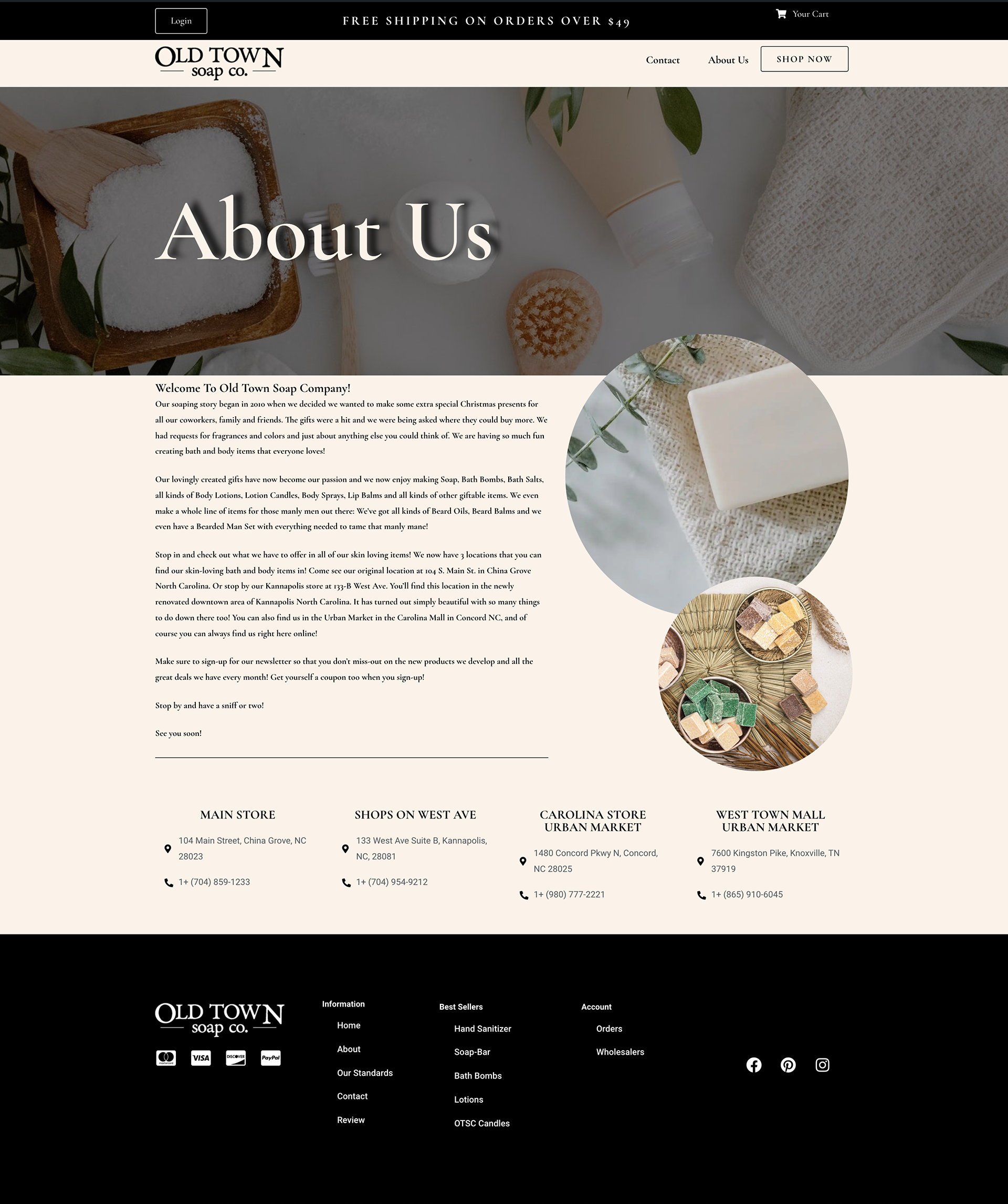
Another rebranding project I did was for an all natural organization called Old Town Soap Co. They are locally owned and operated, located in North Carolina and as someone who primarily views the products and the brand over the internet, I noticed there were quite a few things that I could fix—the first thing being the Comic Sans in the herospace.
I started with the redesign of their website, because their actual one is so disjointed in aesthetics. Everything was a different color, none of the icons matched, and there were at least three different fonts being used all at one time. The second thing I did was change how the website itself worked with the aesthetics, as the original confusing to navigate through.
My biggest task when starting this project was making the website have a unified look and natural feel. They use all organic materials when they make their products, so everything is all-natural and comes from the earth. Their current website doesn't give off the vibe that they are an all-natural company with clashing color schemes, fonts, and imagery.
I also redid their logo as seen in the top navigation, because though their current one is on brand with the "old-town-western" vibe they want, there's a certain disconnect with the products they make and sell. So I went with a simple and clean, typographical logo that wouldn't distract from the aesthetic I created.
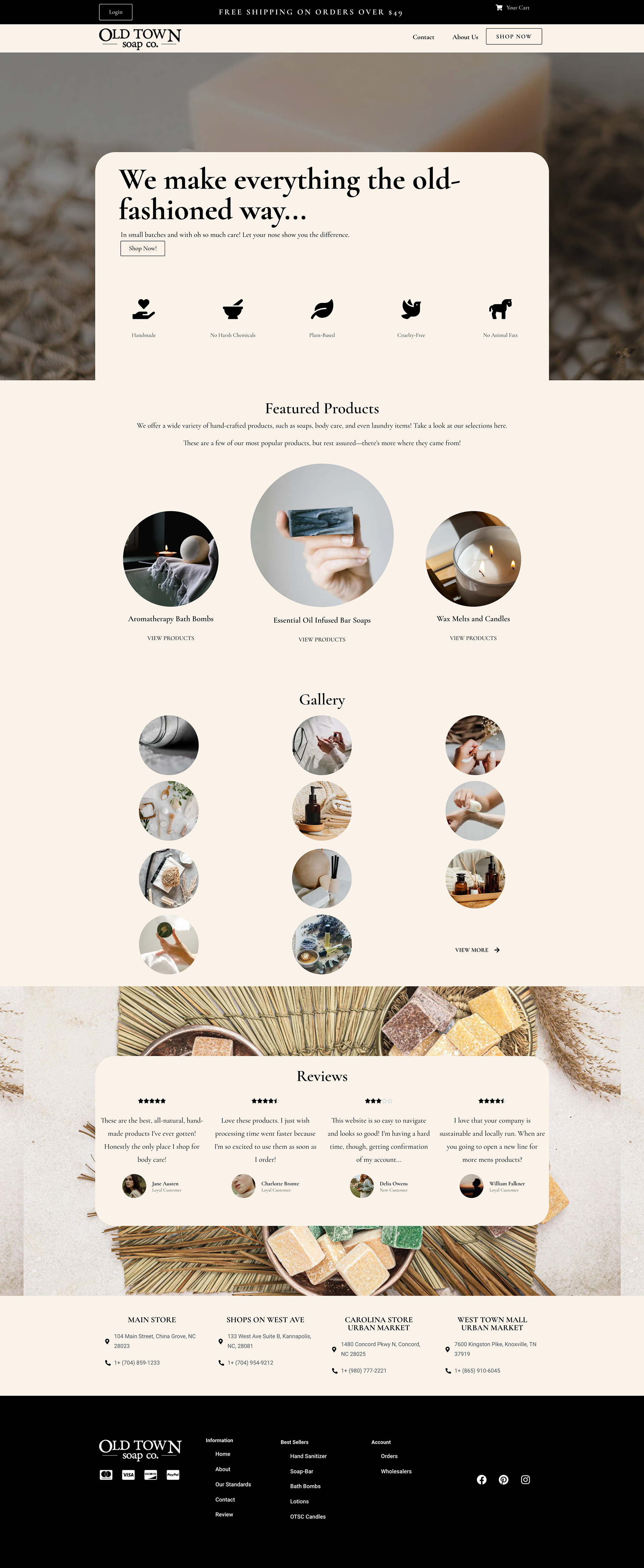
On the original website, finding products is something of a nightmare. They were in a drop down navigation hidden within a hamburger menu that you had to scroll all around in to find what you were looking for. For me as an online consumer, it felt like the steps to get from Point A to Point B was a struggle and a confusing task. Things weren't organized or categorized properly, with miscellaneous items scattered all over the place.
My solution was to create and entire page for these products in a menu style that is easy to look at and follow. They are placed in categories based on their uses versus the type of products they are. So there's different sections for bath, body care, home, accessories, and aromatherapy. There's also a "Men's section" which has products specifically for male hygiene. Since this small business is aimed toward a female audience, their personal care items are integrated within every category and item.
Each of these products would open up to their own page that only has those items, however due to limited time, I haven't created those pages.
I have also created new packaging, because as the company emphasizes all natural products, they're still wrapping their products in plastic and unsustainable materials. So I made a new package that can be printed on sustainable paper for their soaps.
World's Best Donuts
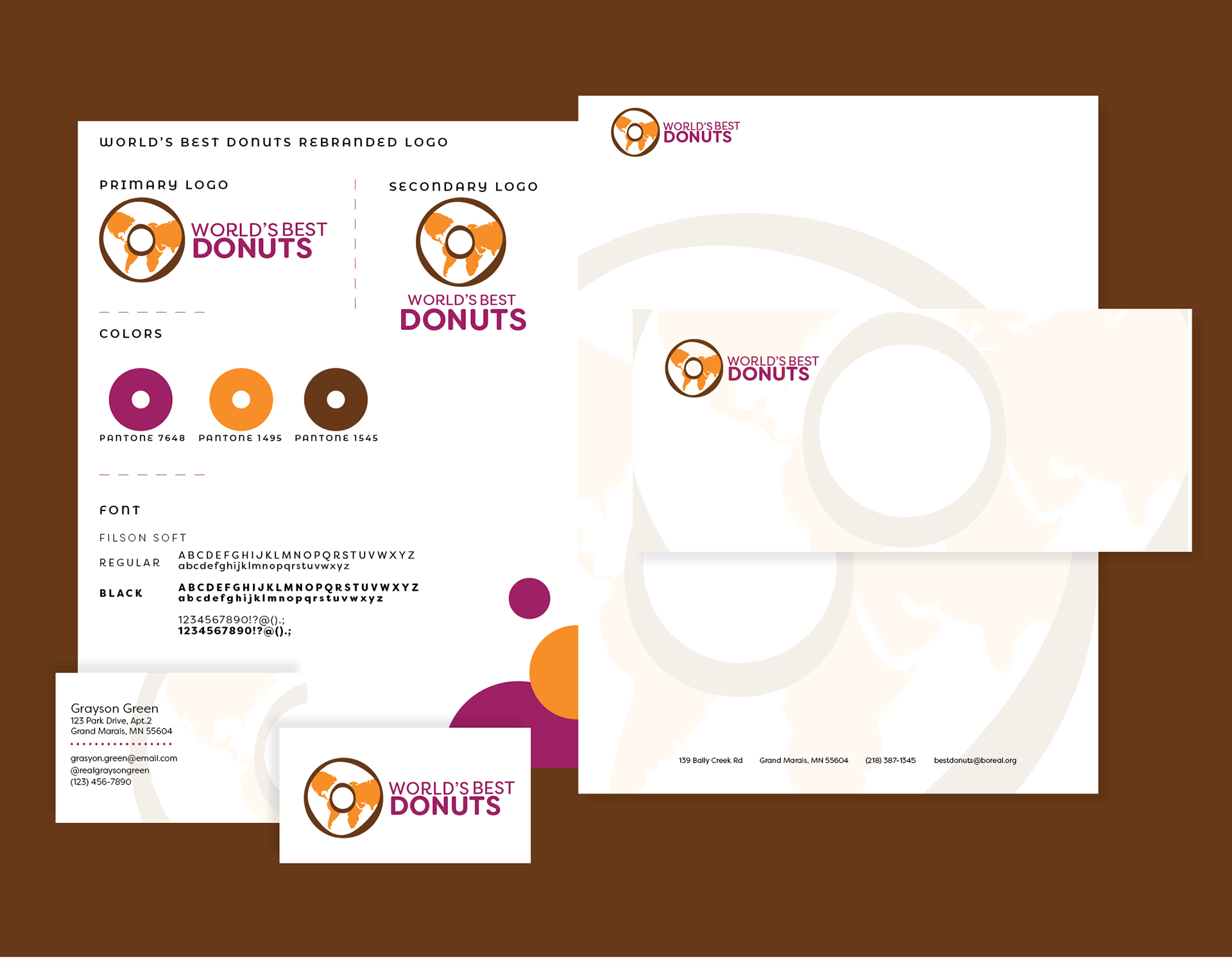
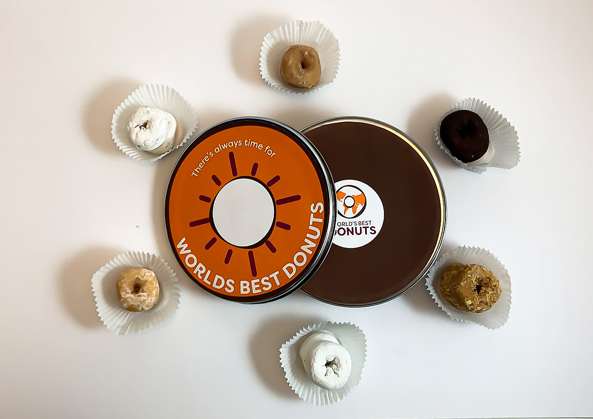
I decided to rebrand World's Best Donuts, a family owned donut shop in Grand Marais, Minnesota. When I first saw the brand for the shop, I noticed that it didn't really stand out—didn't show off their brand to the people. So I drew a world map and made that as a sort of frosting to show off their brand.
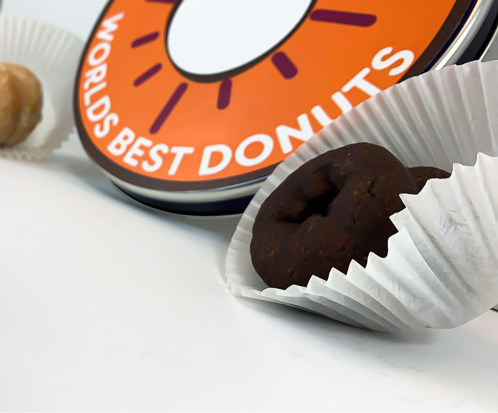
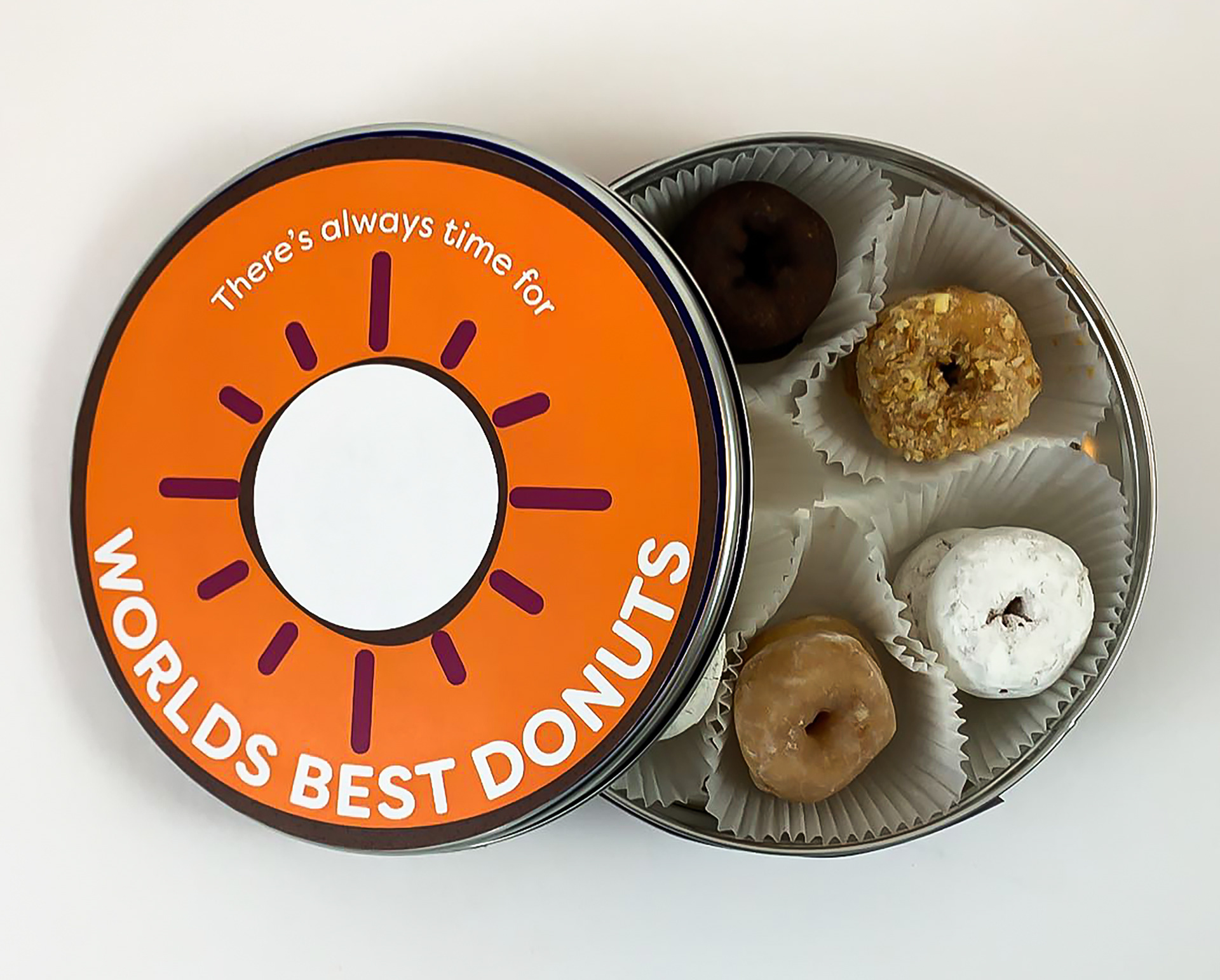
I also created new packaging for their boxes of donuts, repurposing a shortbread cookie container into a donut container—much better than a flimsy to go box!
