This is a magazine cover we did to practice and show our proficiency in the brush tool of Photoshop. The magazine is already a published one, but the cover is completely original. I borrowed a photo from the website of my favorite band, Silent Planet. I also found some images I could create my own brushes from that could emphasize the picture and the band’s message itself, so its symbolic to them as well. The subtext is all my own, as well as the tagline at the bottom. It took be about a day to do this whole project because I fell in love with the idea of what it could be as soon as the details were given. The headline is a play on words for the project itself, while also relating to the subjects that Silent Planet talks about. They question everything from the morality of leaders, to religious faith in the idea of forgiveness when people have done even the worst of things, and the rebirth of the Earth into what it used to be before humans began destroying it. The also tackle mental health and issues of people in everyday life becoming distant and isolated in the era of technology where the “togetherness” of the Internet strips us of the ability to interact as normal people. In their latest album, they tackle the harsh reality of death and delve deeper into the personal mental health of themselves, which is why I chose A Brush With Life as my headline.
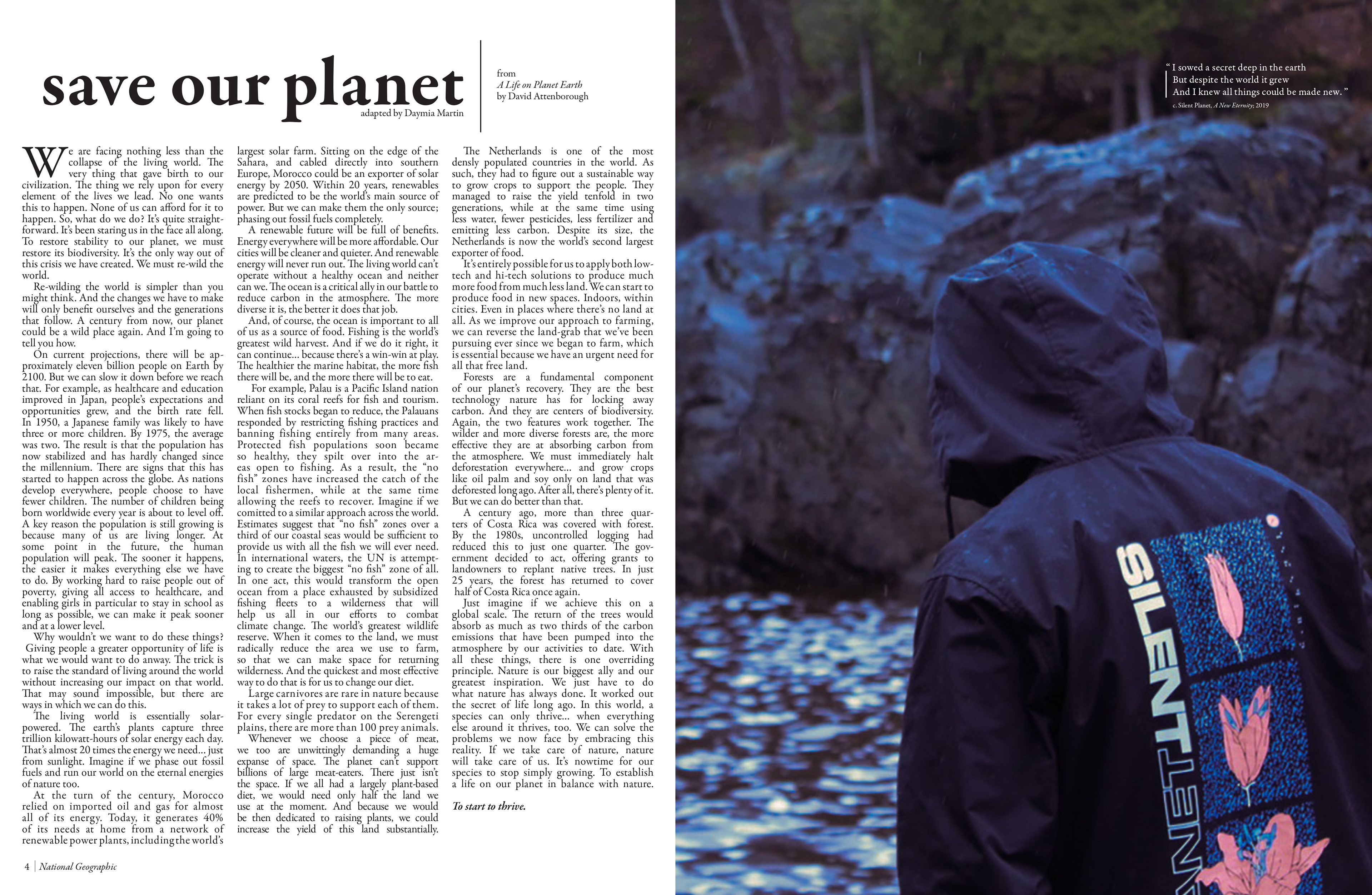
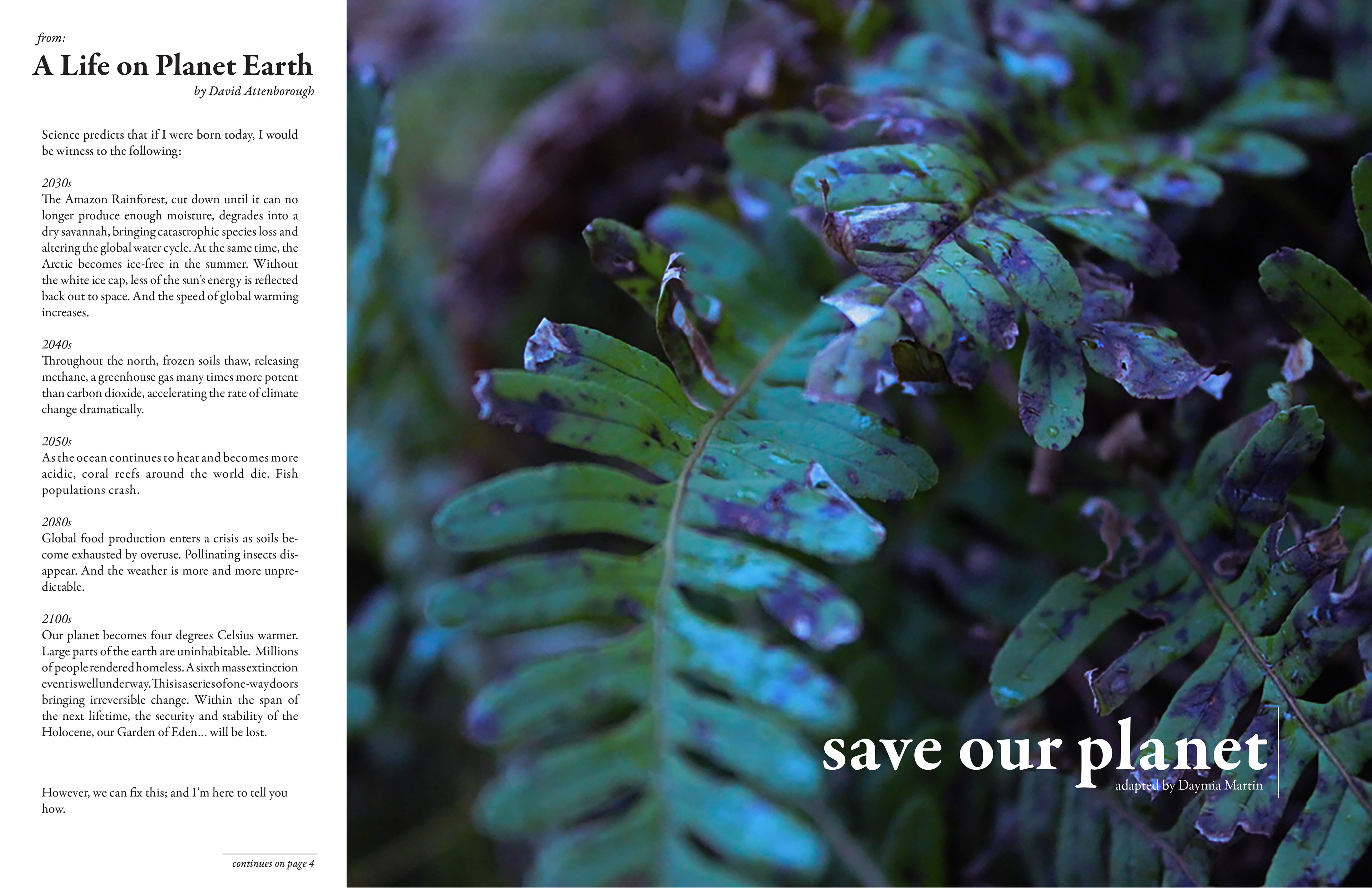
This is an editorial spread I created in the summer of 2021. The project consisted of photos I had taken the previous spring put into a spread. The editorial process is my favorite thing to do in terms of designing, and I created four different layouts because I couldn’t chose which ones I liked the most from my sketches. I decided to put two of my strongest spreads in my portfolio because it’s technically part of a series. I adapted text from a transcript of a documentary by David Attenborough, released during the summer, called Life on Planet Earth. The film is about nature and what we can do as a planet to fix what we’ve destroyed in an hour long visual essay. The images I took were at the Swinging Bridge Trail at Jay Cooke, up in Duluth. It was a rainy weekend, which allowed me to take images that added to the atmosphere and gravity of the prose. I decided to use all lowercase text in the headline, because as important as it is that we do what we can to “save the planet” I wanted to show that the content wasn’t all doom and gloom, that there was a sort of child-like hope to the prose. I also wanted to stray away from the typical layouts of editorials with this content matter, as it’s all big text and urgent, which illustrates a point in it’s own right, I just think it’s overdone and therefore gets overlooked while the reader is browsing through a magazine such as National Geographic. I included a quote from a song called A New Eternity by Silent Planet (not only to relate the cover to these spreads but) to illustrate that everyone is aware of the climate situation, but also that there’s hope for a better future. The song itself is about the damage humans have caused to the earth and questions if this is all we are as a race, while knowing we are capable of great reconstruction.


